Timeless Typography. A comparison of Coke vs Pepsi logos over the years.
I thought this was an interesting comparison though it doesn’t exactly tell the whole story. I believe there were some Coke redesigns in the middle, but they’ve always been subtle or for specific product lines (like Diet Coke). However, the point is, the original corporate mark has remained largely unchanged for 124 years. Now, that’s timeless typography.
Just another day at the office. FMX stunts in front of @oakley Interplanetary Headquarters. #lovemyjob
Cool to see this type of thing going on in the middle of a work day. These pro riders are warming up for an event/screening that's going on tonight.
I love my job.
{ Sent from my iPhone }
My Time Capsule shipped from China, to Alaska, to Oakland...to Memphis? O_o
This is odd...why wouldn't they just send it from NoCal down to SoCal instead of sending it off to Tennessee?
{ Sent from my iPhone }
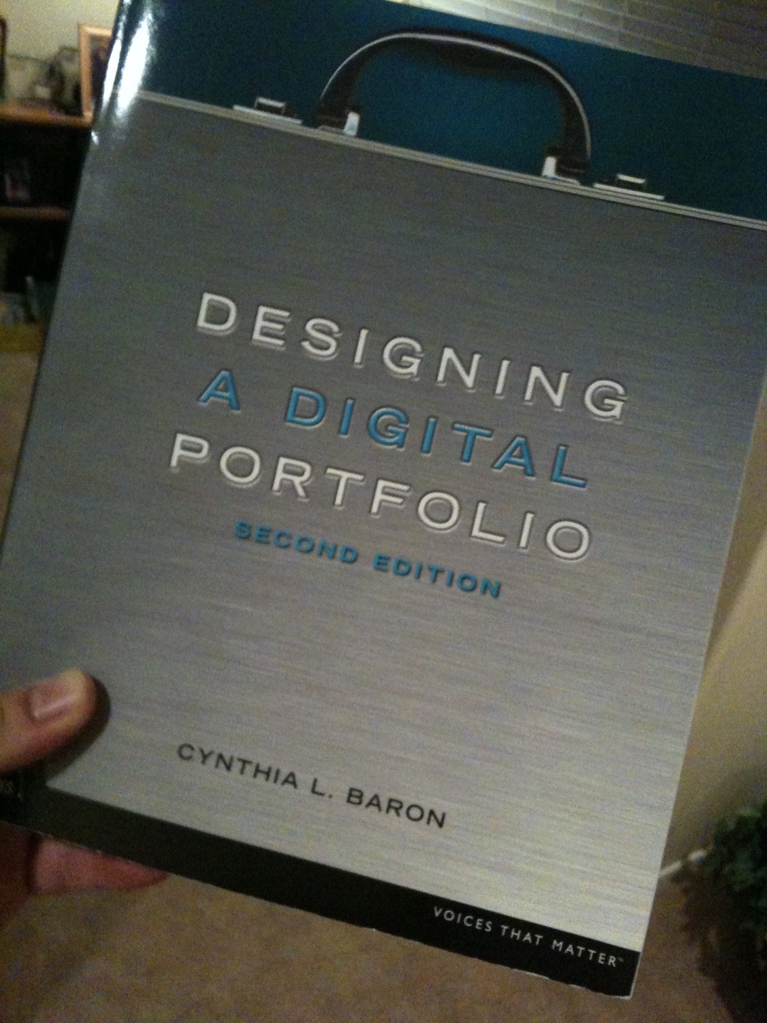
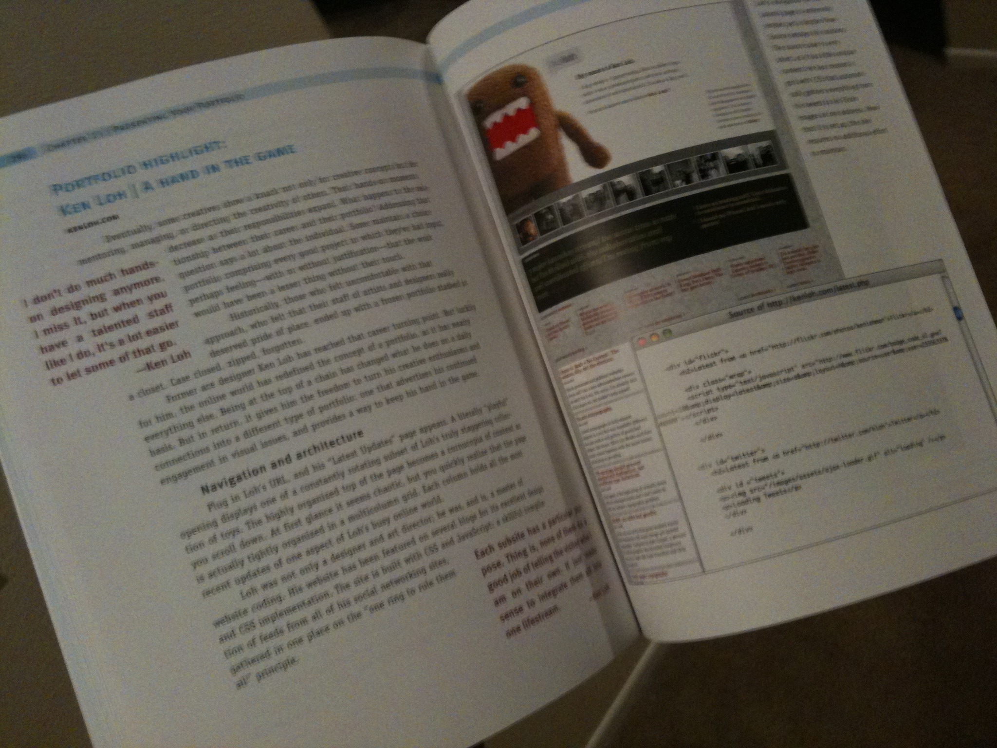
Shameless self promotion: Proud to be included again in 2nd Edition of Designing A Digital Portfolio.
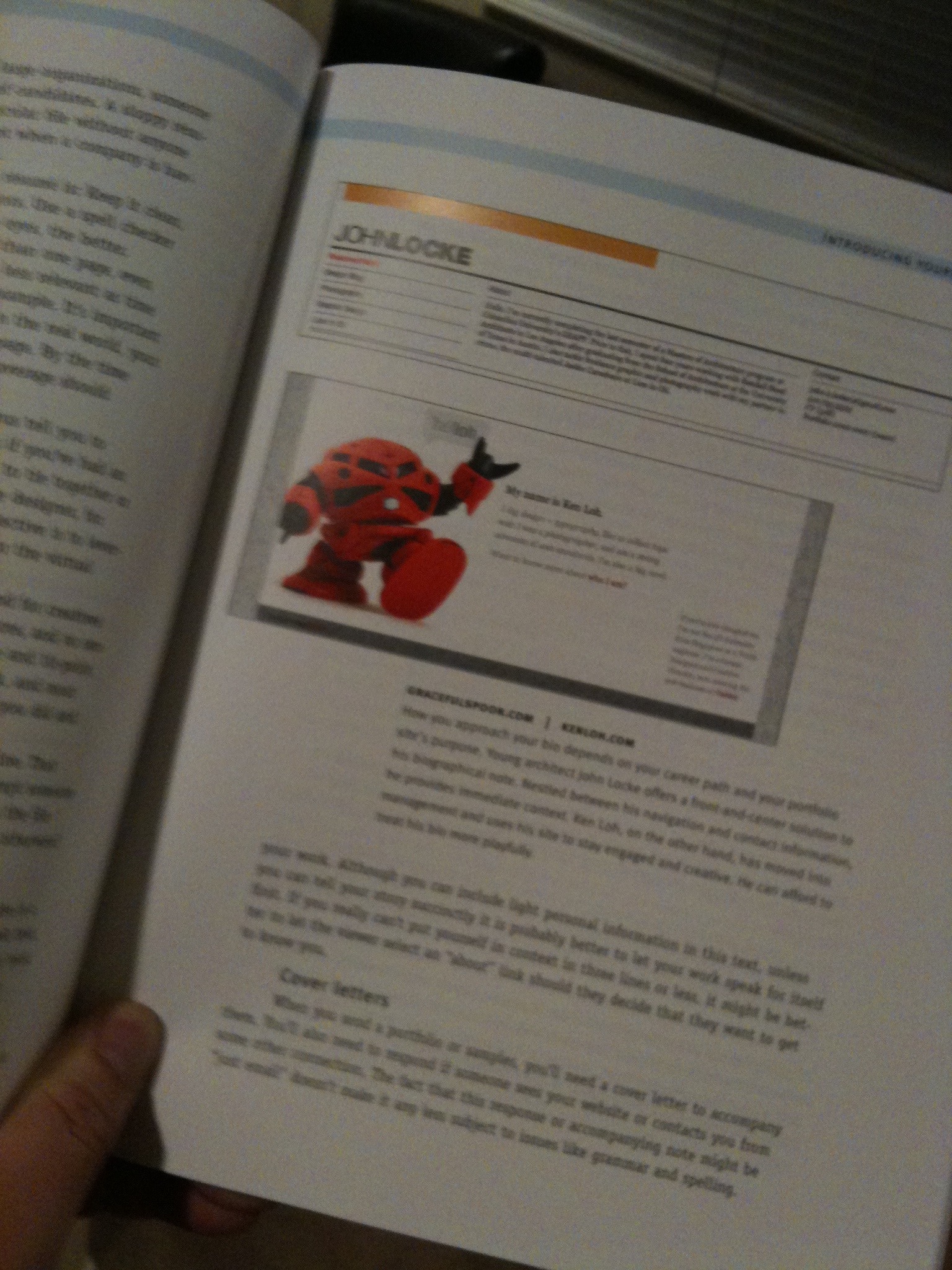
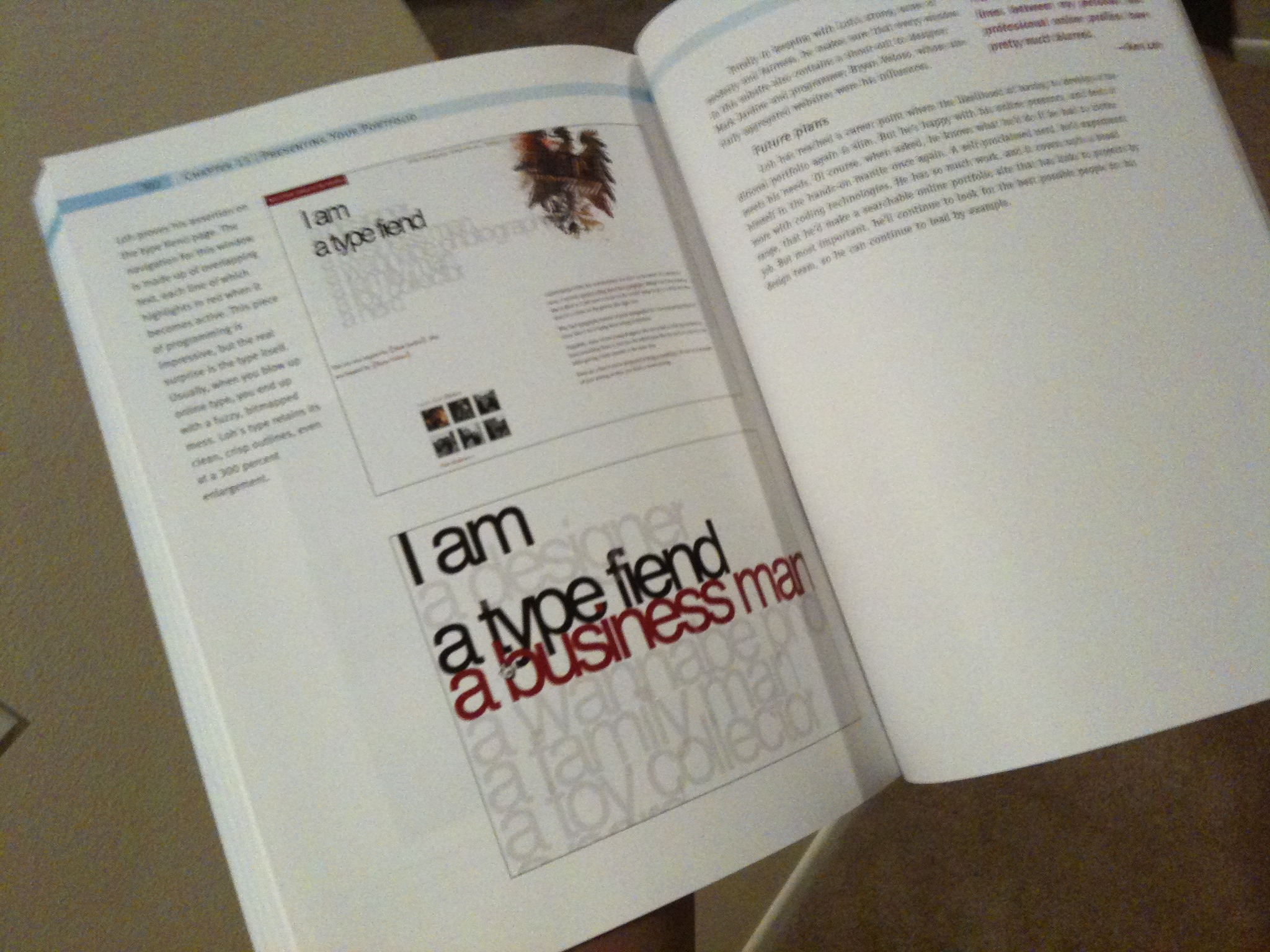
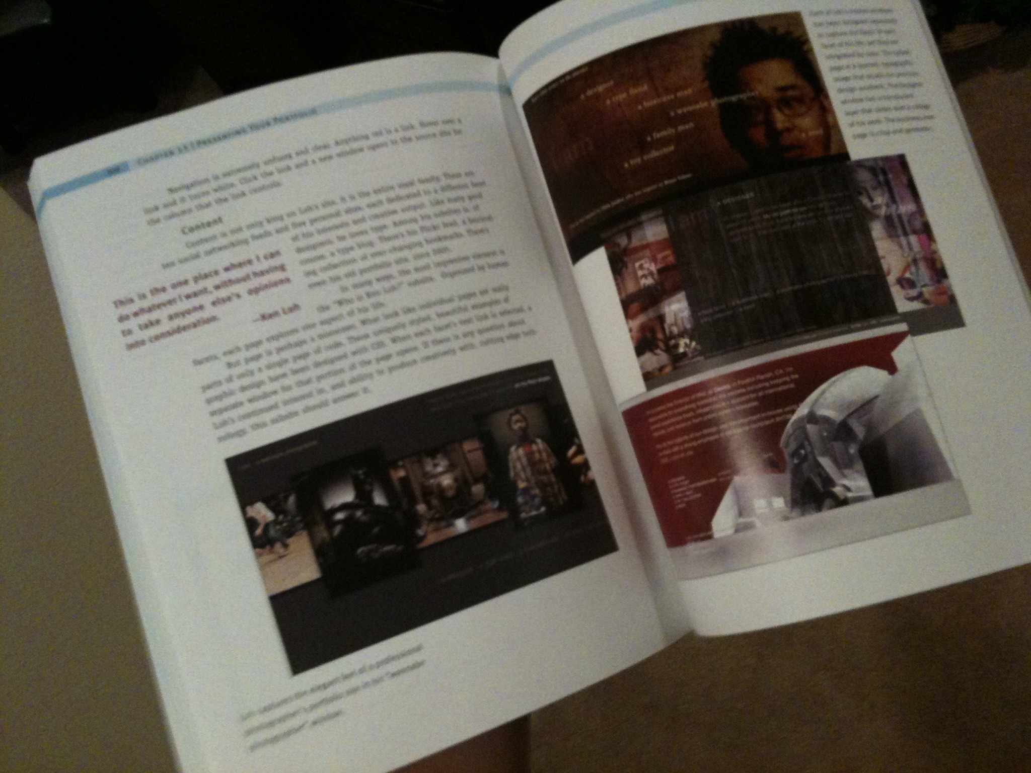
Back in 2003 I was contacted by author, Cynthia Baron to have my old portfolio site included in her book, Designing A Digital Portfolio. 6 years later, the second edition is out and she has included the updated version of my site again with a pretty nice and in-depth (and accurate) writeup. I’m pleasantly surprised at some of the insight she had without some of the topics being discussed in the interview.
I just received my complimentary copy in the mail today so here are a few shots of my pages. Sorry for the fuzzy iPhone pics.
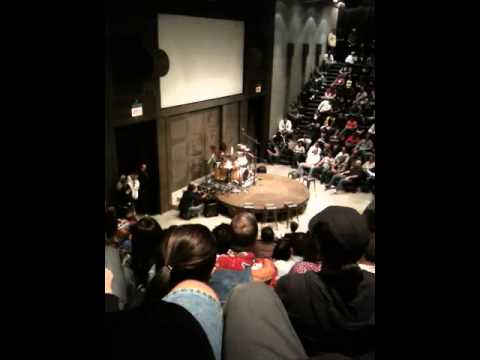
Every team meeting should start like this! #oakley
This is how you get 500+ employees in a 400-seat company theater pumped!
{ Sent from my iPhone }
Some very compelling stats about the exponential growth of the Internet. (AKA “Did You Know 2009 Edition”)
This is kind of a re-hash of some other videos but contains some really interesting tidbits anyways.
Did you know 2.0 (2008 Edition) | Did you know 3.0 (2008 Edition)
And another one that made the rounds known as “Social Media Revolution”:
Example of Mobile Photoshop vs The Best Camera App.
Here’s a little test of a shot I took of the boy at Cars & Coffee last Saturday:
- First shot is edited with Mobile Photoshop
- Second shot is edited with The Best Camera App
- Third shot is the original
I prefer the fine control of Mobile Photoshop but wish it had the ability to do a shadow vignette in addition to the soft vignette. You can clearly see the highlight detail better in the Mobile PS version. My biggest complaint with The Best Camera App has always been the highlights get blown out but I do love the simplicity of it.
A few mediocre iPhone pics of my recently tinted windows and smoked taillights.
I think it’s going to take me awhile before I get around to taking good photos, so I went ahead and shot some with the iPhone camera. It’s a little hard to tell exactly what they look like from these but here are a few quick shots.
All side windows: Formula 1 Pinnacle Ceramic Tints 35
Rear windshield: Formula 1 Pinnacle Ceramic Tints 15
Front windshield: Untinted
None of the shots are edited in any way but the contrast does look higher in these photos than it does in real life. The tints looks black in some shots, but that’s not how it is in reality. The 15 on the back really does helps darken the 35 sides though. The closeup in photo 4 is fairly representative of the real thing. You can also see how much more transparent the tints are when the front windshield is showing light from behind in some of the shots, but all in all I’m happy with how much darker this looks than the same F1 Pinnacle 35 I had on my G35 (all around).
Rear tail lights are smoked with a medium film. I wanted to leave the bottom clear strip uncovered but there is a small area of red underneath so the installers at Tint Plus did not recommend it since they weren't sure how well it would hold up over time.
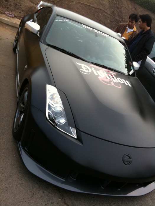
Met up with @chriscasper at Cars & Coffee. Ironically he parked right in front of me.
Chris showed up after we did but I find it amusing that he was able to get a parking spot right in front of us. Lot was pretty full when we got here.
{ Sent from my iPhone }

