Inspired by Katniss, my girls make their own bows and arrows with twigs.
During lunch-recess at school yesterday, the twins found a couple of twigs and sticks which prompted them to build their own bow and arrow using hair ties. Guess it was such a hit with them that when they came home, they built a whole bunch more.
Green goodies + Professional Russian blowing things up = St. Patty’s @oakley
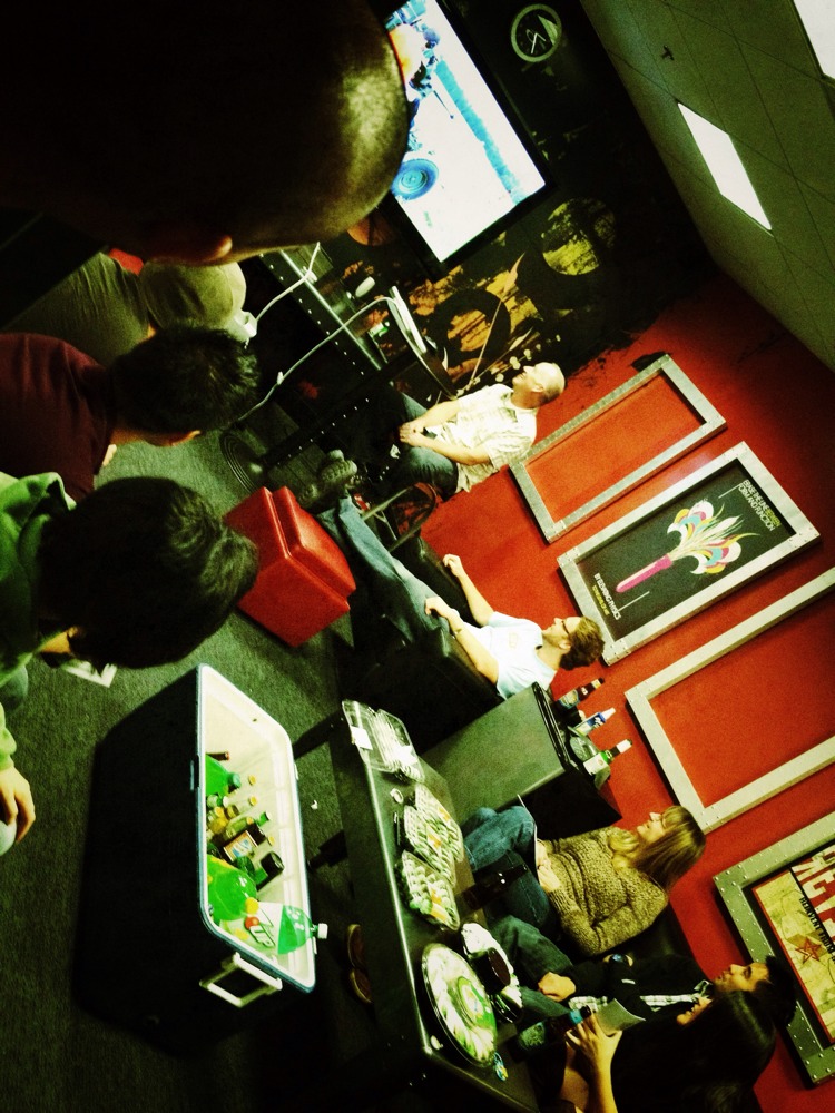

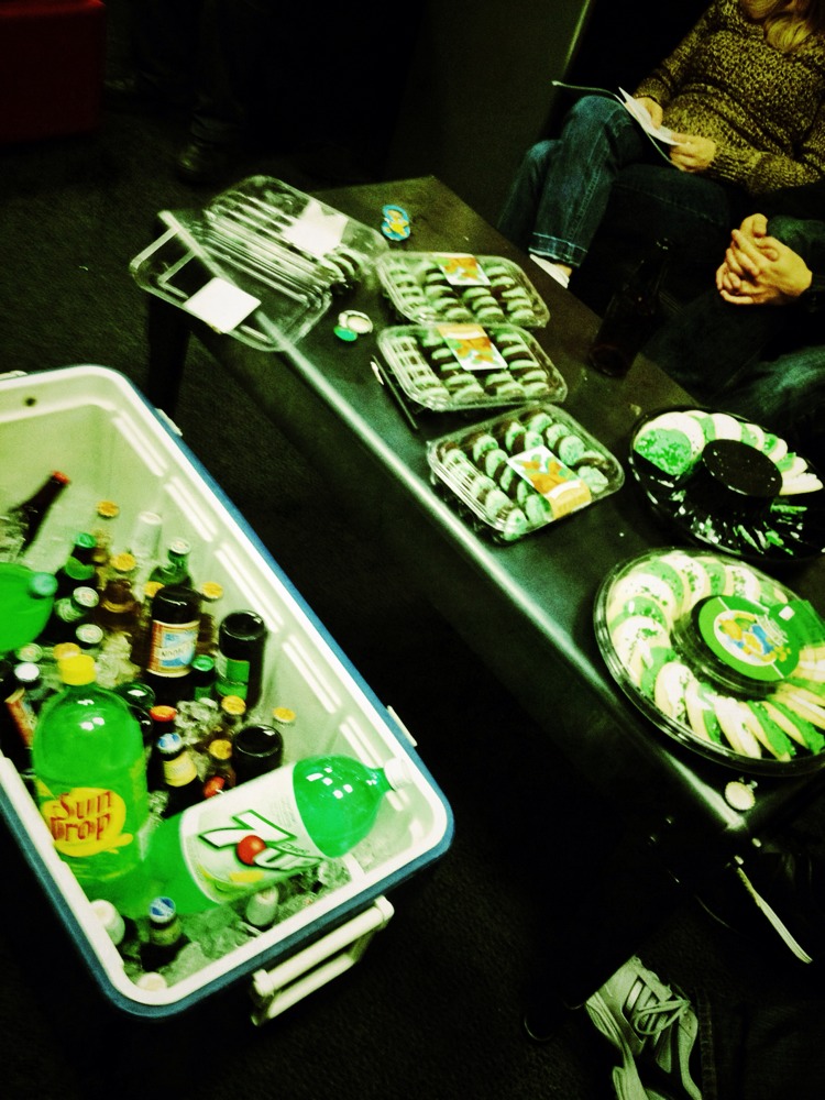
If you haven't seen his videos, check ‘em out on YouTube
This one in particular is quite entertaining:
iPhoto in iOS can’t compete with Snapseed (test comparisons).
Being the Apple Fan Boy that I am, I was really looking forward to iPhoto in iOS. Apple did a pretty decent job with it and has added some unique features that I think are really cool, but at the end of the day, Snapseed still reigns supreme. I thought I’d share some experiements.
Here’s the original image taken from my iPhone 4s just for comparison sake:
1st test | Duotones
Duotones are a little easier to do in iPhoto (left image) since they pre-package it as one of the image enhancement options. It’s hard to tell, but I also sharpened the face and tie, just to bring a little extra emphasis in those areas. The ability to isolate certain areas for editing is a great feature in iPhoto. Snapseed (right image) adds Tilt-shift, vignette and grain capabilities which helps reinforce the vintage camera look. It’s a bit difficult to get match the colors exactly right between two images when you’re working on a device that can only show one app at a time (I used my iPad 2 since it’s a larger screen than the iPhone), but this gives a general idea of the differences:


2nd test | Sepia
Again, iPhoto (first image) deals with presets and is relatively easy to pull off. The B&W effect also has a vignetting option which helps, whereas Duotone does not. One nice feature is that it’s able to retain the settings from the previous edit, but it appears you can only add one “effect” with each edit. Unfortunately, you can see that the highlights are a bit blown out which makes the face not look so good. iPhoto gives you the ability to adjust the B&W filter pretty easily, but you can’t isolate areas like you can with some of the other filters, so I wasn’t able to hold the exposure in one area and not another. You can do it by going back to the exposure setting, but it’s a little cumbersome since it removes the sepia effect until you re-apply it so it’s difficult to see exactly how your edit will affect the final image. The Snapseed version (second image) has much more control so I was able to make sure the most important part of the image (the face) was well preserved. In some cases, I prefer crisper images, so I also tried another version in Snapseed (third image) where I didn’t do any of the Tilt-shift or grain effects, just for comparison. The downside here is, in Snapseed, vignetting is usually a part of another effect, so if you want to keep it relatively clean, there isn’t a real easy option to add just a vignette.


Since I’ve been using Snapseed for awhile now, I’m pretty fast with it. Factoring out the learning curve for iPhoto, it still seems like the amount of time needed to edit the images was a lot longer and a little less intuitive. This is where Snapseed really shines. It’s such a quick, simple app that editing is not a chore. One negative though, is that it’s pretty much a linear process, whereas in iPhoto, it seems you can go back and adjust previous edits fairly easily. Love that feature.
Just for fun, I tried another version in Snapseed without taking all of the color out of it. I’m a sucker for desaturated images.
In conclusion, both apps are quite good. Way better than the multitude of iOS photo apps out there. I’ve tried a ton of them and while some have interesting aspects and decent filters, I always find that I come back to Snapseed. If I didn’t have Snapseed, iPhoto probably would take it’s place.
Baffled as to how this metal on my iDrive knob got warped.
A few days ago, i felt a sharp edge on my iDrive knob while I was selecting music. I didn't think much of it since I was driving and just figured I ran my finger along the edge. I can’t really see that side since its blocked by the knob itself from my position in the drivers’ seat.
Today, I felt it again and took a closer look. At first I thought maybe it was just a clear plastic sticker that was coming loose after time in the sun (you know, like the ones that ship with metal products to keep them pristine which you sometimes don't realize is there so you don't take them off), but upon closer inspection, I found that the metal ring had a bunch or warps in it.
It looks like someone literally tried to pry it off with a skinny screwdriver in a few places. No one ever drives my car except for me. My passengers don’t touch the iDrive (at least not that I’m aware of), and I can think of only 1 place I had to valet park it within the past few months so I have a hard time believing this was human-induced.
I'm struggling to figure out how the heck this could have happened though. Any ideas?
Snapshots from my 3/4 mile walk from the parking lot to the office in Mason.
My meetings didn't start until later in the day so I worked from the hotel in the morning. I wasn’t thrilled to find that there was absoutely no parking which meant I had to park at a church that was about 3/4 mile away. At least it gave me an opportunity to snap a few pics on the walk back in the afternoon.
One thing I love about Cincinnati is the wide open spaces. There are some charming homes with lots of space between them. I’m definitely not in California.
Ok web geeks, how is it possible that Safari renders pages differently based on the network connection?
The two screenshots displayed here are taken on the same machine (13" MacBook Air on OS X 10.7.3) and same browser (Safari 5.1.3). The ONLY difference is, the one above was taken while logged on to my home network, and the one below was taken while logged on to the network at the office.
As you can see, the one below is displaying scrollbars. Changing the window sizes makes absolutely no difference. The CSS is specifying a max-height and overflow:scroll for each of the DIVs. On the home network it behaves as expected, only briefly showing the scroll bars when you, ahem, scroll, then they disappear. On an iOS device, regardless of what type of network connection it works beautifully, never showing scrollbars at all.
I get that the scrollbars will appear on other browsers like Chrome, Firefox and the dreaded IE at this time, but this behavior in Safari is puzzling. Why does the same browser display 2 different results? The network factor is the only difference I can think of. I've tested this a couple times in the past few days, and the results are the same.
New Installation at 1 Icon.
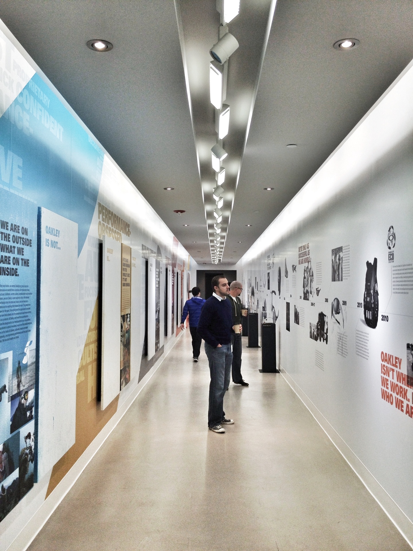
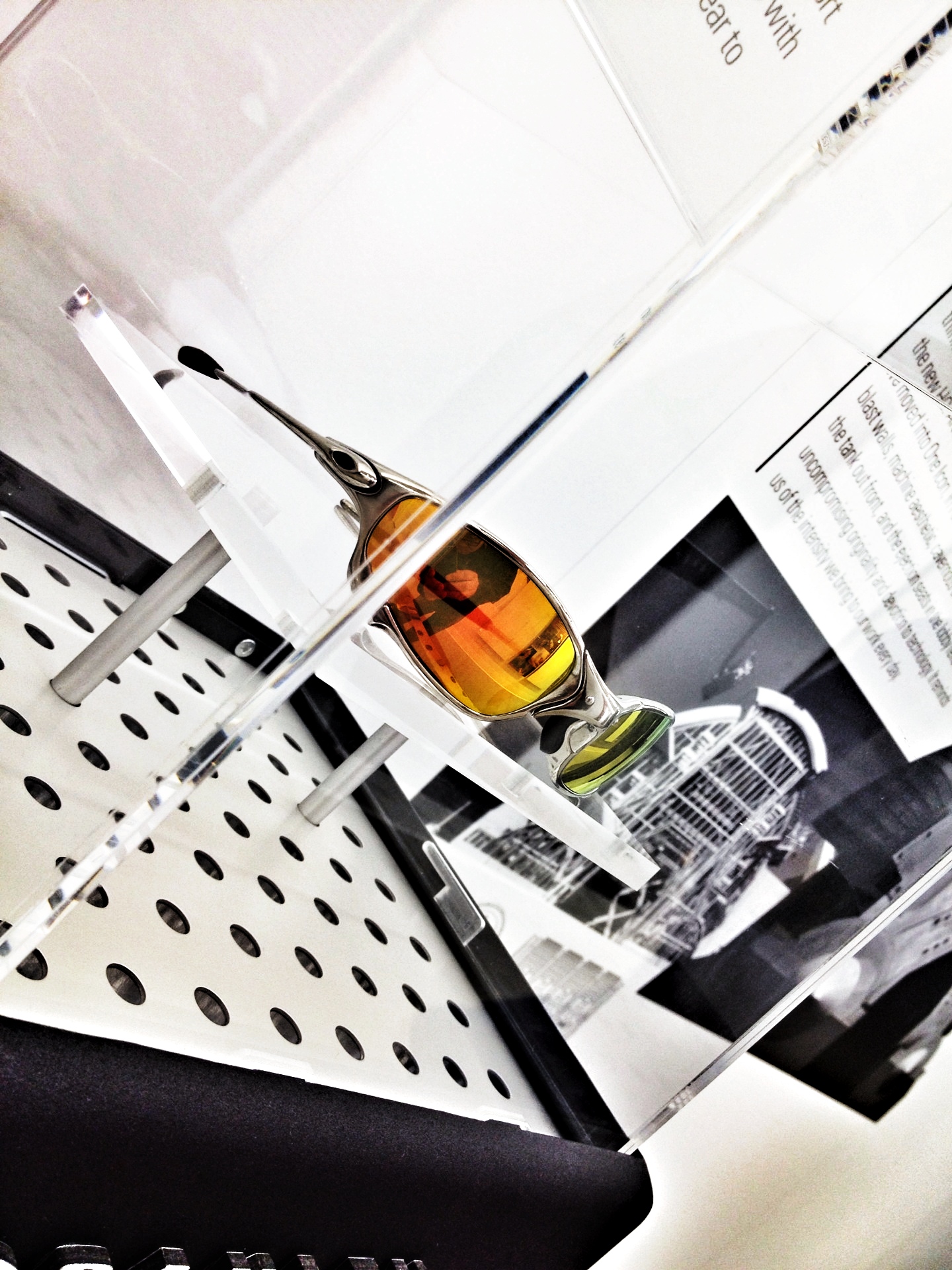
More than 1000 sales reps from around the world are gathering this week for our Global Sales Meeting. What better time to put up a new installation that showcases some of our core values as well as some iconic products throughout our history. This is an interactive display. No, not digital, but employees will get the chance to write and comment on the walls regarding that Oakley “is” and “is not.”
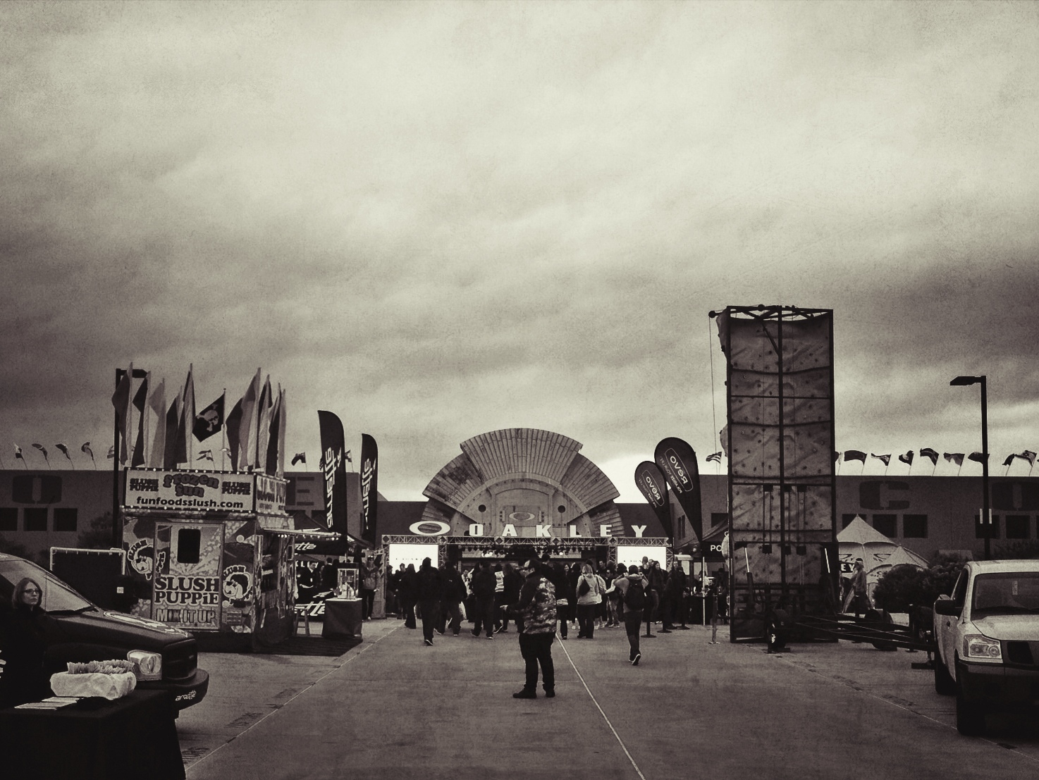
Day one is at headquarters, so as usual, it’s a festive atmosphere. I love walking up to the building in the morning and being able to hear the DJ pumping music all the way from the lower lot. There's only room for 30 flags on the building, but over 100 countries are represented here today.
Pics of the new Man Cave.
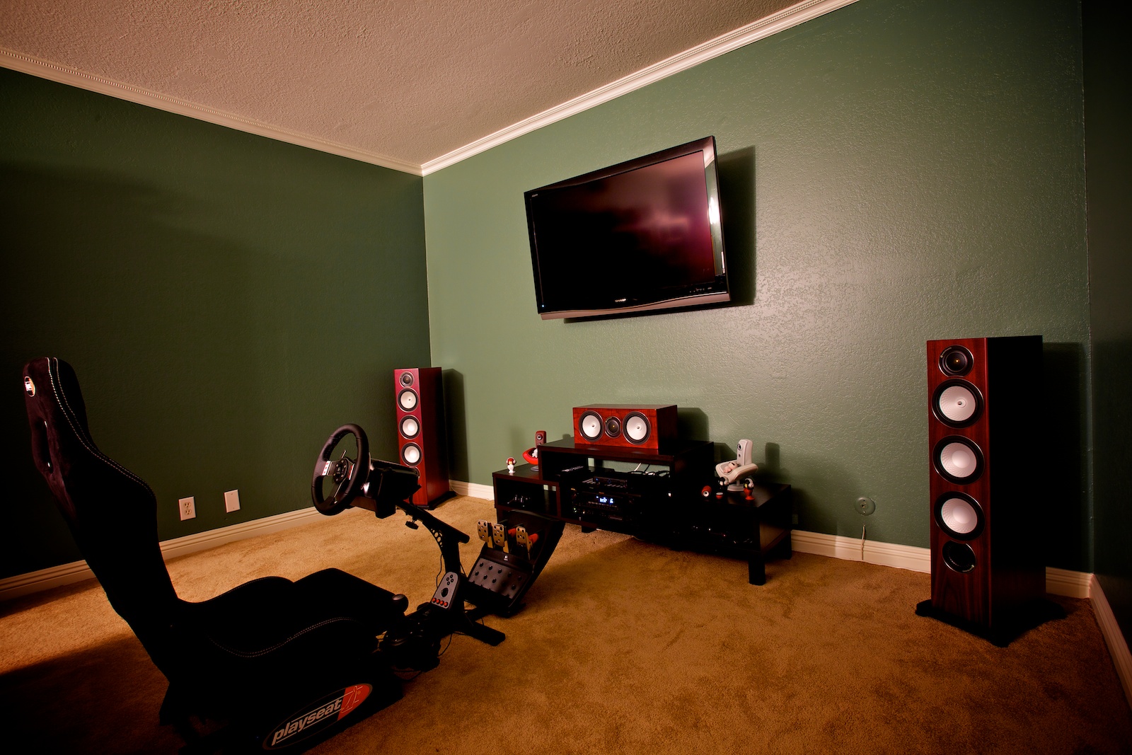
It was an early Christmas for me when I got my speakers installed yesterday, but there’s something terribly wrong. No, it’s not the fact that the subwoofer didn’t come in with the rest of the speakers, but clearly the TV is way too small! Looks like I need to start planning my first upgrade, hehe.
I was amused by how nicely my Tokyoplastic Koguma vinyls matched the Monitor Audio Silver RX Rosenut Wood Veneer color. I just had to put them on display nearby.
Below are a couple views from the Entertainment and Office Sides of the setup. The last pic is pretty crappy but I just wanted to quickly show the speakers in the ceiling. The futon will eventually be replaced with a couple of bean bags since it kind of chops the room in half. The office portion of the space isn’t as tight as the picture makes it out to be. Should have picked a better shooting angle. The front of the futon is about the halfway mark in the room.
The other big problem with this new setup is, I’m having a hard time getting myself out of this room. Even without the sub, the sound is pretty awesome. Even working on my computer is more pleasureable since the music is no longer coming out of the DX4 studio monitors (by M-Audio) on my desk. They’ve done a decent job these past 6 years, but nowhere near the quality of these Monitor Audio RX8’s.
Big thanks to Ben and Ryan for helping me decide on this setup! The music quality is much better than my previous home theater setup which was optimized for movies. This setup is far more versatile, and playing Gran Turismo 5 is fantastic with the sounds wizzing by on the proper sides. I was going to wait for the subwoofer before I watch an action movie, but I’m not sure I’ll be able to hold out.
TV and Speaker installation by Jaime Garau of Orange Coast Audio Video.

