LogoGarden must die. Another ripoff spotted. This time, mine. #LogoGarden
I found out about this miserable website thanks to a tweet by my friend @hemeon. They sell “Do-it-Yourself Logos for Entrepeneurs” on the cheap by letting any schmo off the street composite their own using a flash application.
It’s bad enough that the concept of this site completely trivializes the design industry, but they make it even worse by ripping off the work of real designers. I realize every business can’t afford to hire a professional designer, so there probably is room for this type of service – although I despise the concept. However, the old addage “you get what you pay for” is not playing out here. In this case, they’re getting a helluva lot more. Surprisingly, the site includes “variations” of some pretty well-known designs…yeah, WWF and Time Warner won’t notice…

Image source: RockPaperInk
Marc’s tweet prompted me to go through the LogoGarden site for about 20 minutes and I witnessed a bunch of attrocities while looking for anything that I might recognize. After wading through a ton of pages of badly hacked-together logos, I began to think I wouldn’t find anything of mine. However, once I realized I could see a lot more by trying out their “free” sample build, it didn’t take me long to come across this:
I designed the logo circled in red probably 18-some-odd years ago. It was a concept for a pet insurance company named PetNet, and although it didn’t get bought, it's been on my porfolio site for maybe 10 years or so (yes, the site is that old, thus the crappy design, UI, and ugly URL). Here’s a closer look:

I’m a little late to the game, since apparently there are a lot of other posts about this topic. Here’s a few for your reading pleasure:
- More Logo Thievery (Iconify.it/Scott Lewis)
- Thoughts on the LogoGarden Controversy (Dani Nordin)
- How Low Can They Go? (LogoLounge.com)
- Perils of DIY Logo Makers (Logofactory.com)
- LogoGarden’s Bitter Harvest (Logofactory.com)
- Grand Theft Logo (Judity Mayer/NWICreative.com)
- LogoGarden.com harvests logos from pros (LogoMotives/Jeff Fisher)
- LogoGarden Should be Plowed Under (Prejean Creative)
- Love Thy Logo (Rock Paper Ink)
- Facebook page
- Twitter trend #LogoGarden
If any of you fellow designers find your logos being ripped off by LogoGarden, report it to their webhost, Rackspace and let’s hope that this shady operation can get shut down.
(hat tip to Brent Pelloquin for his post: How To Get Your Logo Removed from LogoGarden)
Evolution of Starbucks logo from 1971-2011. I like how clean it looks without the type.

When a company can drop the type and have a mark still have instant brand recognition, it's a good thing. I like how clean it looks.
This Futurity article indicates some of the reasons as being for localization purposes in Asia, which makes a ton of sense, however, if it's a new brand being introduced into the market, I’m not sure not having a name written out somehow is the best idea. The most surprising thing from this article though, is that Starbucks is 40 years old!
Step-by-step progression of how I created my “Have A Nice Day” skate deck, part 1.
I hadn’t done an art project in so long that when our Web Creative team suggested we hold a 2-Tone Skate Deck Challenge, I jumped at the opportunity. Had tons of fun doing it, but definitely felt out of practice. Here’s a quick writeup of how I did it.
Step 1: Started with a deck donated by our friends at Arnette. It already had a design on it, so the instructions were to either paint over it, or sand it off to have a clean canvas to start.
Step 2: I was too lazy to sand the board smoothly so I decided to use the original design in the background to some extent for additional textural elements. I scratched up the surface with rough sandpaper to give it that “used” look.
Step 3: Sprayed a little chrome paint in a few key strategic areas to give the base some shine. The pictures don’t really do it justice, but I really liked the way the deck looked at this point. The chrome on black scratched up paint was really cool. I wish more of this look could have been preserved in the end result.
Step 4: Used painters tape to mask off the “rising sun” pattern in the background, then spray-painted a soft black border to draw more attention to the center of the design. In the end, this border kind of disappeared with all the other layers of paint I put on.
Step 5: After spraying the black border, I filled-in the “rising sun” pattern. The design started to look a little too harsh at this point, but I knew I was going to add some additional layers so I didn’t freak out too much.
Step 6: Came back with another layer of spray paint to soften the edges, kick back the background design, and add some texture for modeling. Used both white and chrome in this step for some slight splatter effects.
Posterous seems to be a little buggy when it comes to posts that have lots of different images in different sets, so I broke it up into 2 parts.
Continue on to Part 2
Skate deck progression, part 2.
Step 7: I actually messed up here since I tried a different paint for the yellow skull. I wanted visible thick brush strokes but that didn’t quite work out. I had to clean it off, but there was still some residue left over and I also realized the original circle was placed a little too low. Instead, I masked off a new circle with frisket and spray painted the base. Once that was done, I cut more frisket for the skull detail and first layer of typography.
Step 8: Painted a base layer of chrome for the typography, then sprayed the skull black and added some gradients on the type.
Step 9: Here’s what the deck looked like after removing the frisket at this point. I considered calling this “finished” at this point, but I didn’t like how that original layer of yellow was still visible at the bottom of the skull so I decided to paint a “glow” around the skull to cover it up.
Step 10: Final step was to mask off the skull and type again so I could spray another layer of white for the glow around the skull, then some additional chrome and black for the extra channel around the type.
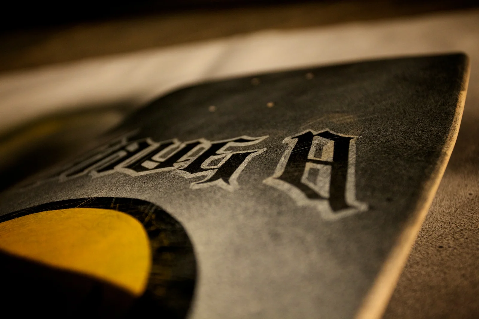
End Result: I was pretty nervous about that final step since I could have easily messed things up at that point painting more layers that covered up the previous work, but I was relieved it didn’t turn out too bad. Since I used chrome, the visibility of the outer type channel and splatters change depending on how the light hits it. Overall, it was a ton of fun and I’m generally happy with the results.
Return to Part 1
Oakley might be testosterone-filled, but 3 talented gals took 1st, 2nd and 3rd in our Web Team Skate Deck Challenge.
I’m very proud of these three young ladies and thoroughly impressed with the work from them and everyone else on the team on this project. There were a total of just over 200 votes by random Oakley employees who chose to participate. It was a fun project for us to work on. Big thanks to @mizo_kizo for setting it all up.
And the winners are...
1st Place: Lacey Garcia

2nd Place: Tara Larivee

3rd Place: Cassie Fuertez

And here’s a few shots of the other artists, presenting their creations:
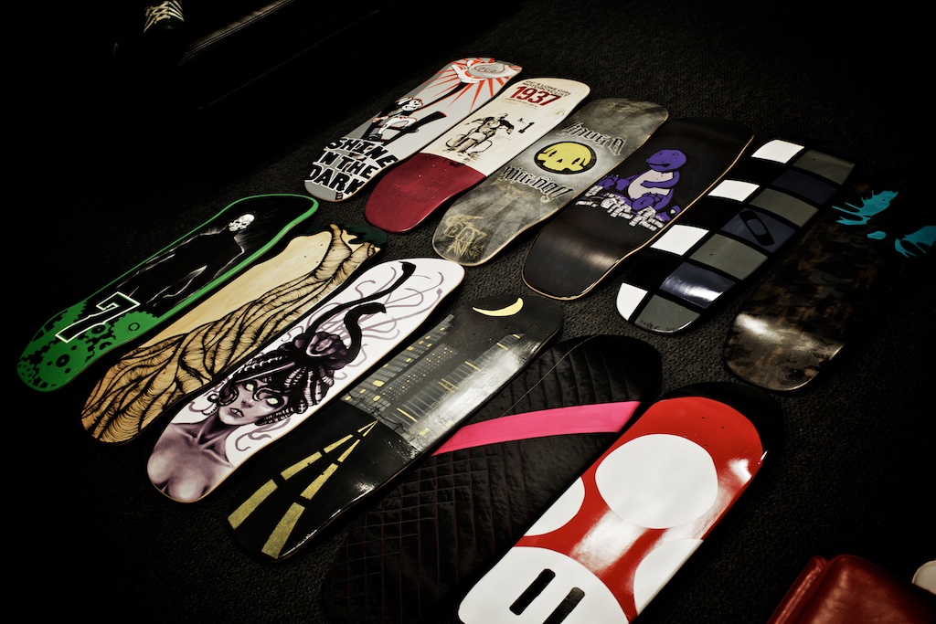
2-Tone Skate Deck Challenge by Oakley Web Creative team.
Inspired by the recent 2-Tone Dunny Series, our Web Creative team decided to hold a 2-Tone Skate Deck Challenge. Armed with decks donated by our friends at Arnette, each participant was given a PMS color swatch they had to use, in conjunction with any other form of black & white. There were no rules other than you had to stick to your specified color. Theme could be whatever each individual chose. Most chose to use traditional paint, but one was actually sewed (see second-to-last closeup shot above).
We even had an entry from Marco’s boy, Hunter. He got a chance to do one after @sixmode informed us he probably wasn’t going to have time. The boy unintentionally dissed Chris during his presentation and Chris turned beet red. Too bad I didn’t get a shot of that.
First, Second and Third place winners will receive Arnette decks, labeled appropriately, 1st, 2nd, and 3rd, like the one below:
I have some other shots of individuals presenting their work, but will refrain from posting those until all the final voting has been done so the judges don’t get tainted by who did which one.
Here’s a quick snap of some of the crew:
Gap reverts to old logo. Design world rejoices. Laird+Partners loses credibility.
AdAge reported a couple days ago that the Gap logo was actually for real, and not some stupid PR stunt or elaborate crowdsourcing experiment. Today, they broke the news that Gap will scrap their new logo and return to the old design. I am so glad Gap decided to revert back. It was the only thing they could have done to “fix” the mess that was created by the release of their new logo. They could have very easily dug themselves deeper with any other move.
It’s a good day in the world of design. Well, for everyone except Laird+Partners, the agency who was responsible for that debacle. They should stick to advertising and not try to design logos...or websites for that matter. Here's what it looks like on an iPhone right now:
Way to go guys. Here’s a tip. When building flash-only websites, try to at least make it look like you attempted to view it on a mobile device. Good luck getting out from under this PR mess...
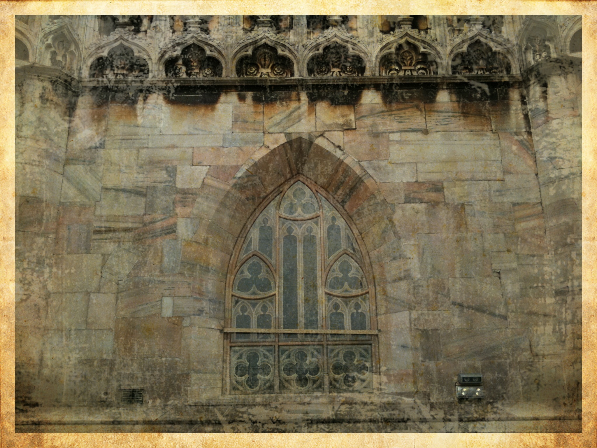
A few iPhone shots around Duomo di Milano in Italy.
Although it seems like I’ve been in Italy for a long time, I actually had very little time to get out and explore on my own. The last 5 days have been full of meetings and meals with my Oakley and Luxottica coworkers. Today (the day before I leave) was really the only day I could do some shopping and site seeing, and even that was limited to just a couple hours since I still had other business functions to attend to.
The Interior. This first one was pretty creepy. I overheard someone saying this was a statue of someone carrying his own skin. Don’t ask me why or what that was supposed to represent. The cathedral is huge inside. The images in the middle are only two of the dozen or so scenes on the inside. There were also huge paintings and stained glass everywhere (which, like an idiot, I didn’t take any pictures of). The last shot with the nuns is the main podium area. There is also at least one massive crypt underneath the cathedral (that had the remains of some saint) but I wasn’t able to get down to see that since it was closed.
The Exterior. There are amazing marble statues everywhere. Literally. In fact, it seems like the entire exterior is made from carved marble. I could figure out that some of the scenes were based on biblical stories, but some, like the first one here, were just plain obscure and weird. What the heck is that creature is at the bottom. Horse (or dog’s) body? Flippers for feet? Snake-like head? Just weird.
The Roof. The building is free and open to the public, but for €8 you can buy a lift ticket to get up to the roof. There were also stairs on the other side which might have been free, but it was pretty hot and humid out so I went for the elevator. The roof is pretty incredible since there is just detail everywhere you look. There must be thousands of statues all over this building.
The Plaza: And finally, here’s a couple shots of the horse & rider in the middle of the plaza, along with a detail of the lion underneath. The last shot is of one of the adjacent buildings which is full of shops.
For those interested, these were all shot on an iPhone 3GS and processed with the Pic Grunger app. More information about Duomo di Milano can be found on Wikipedia.
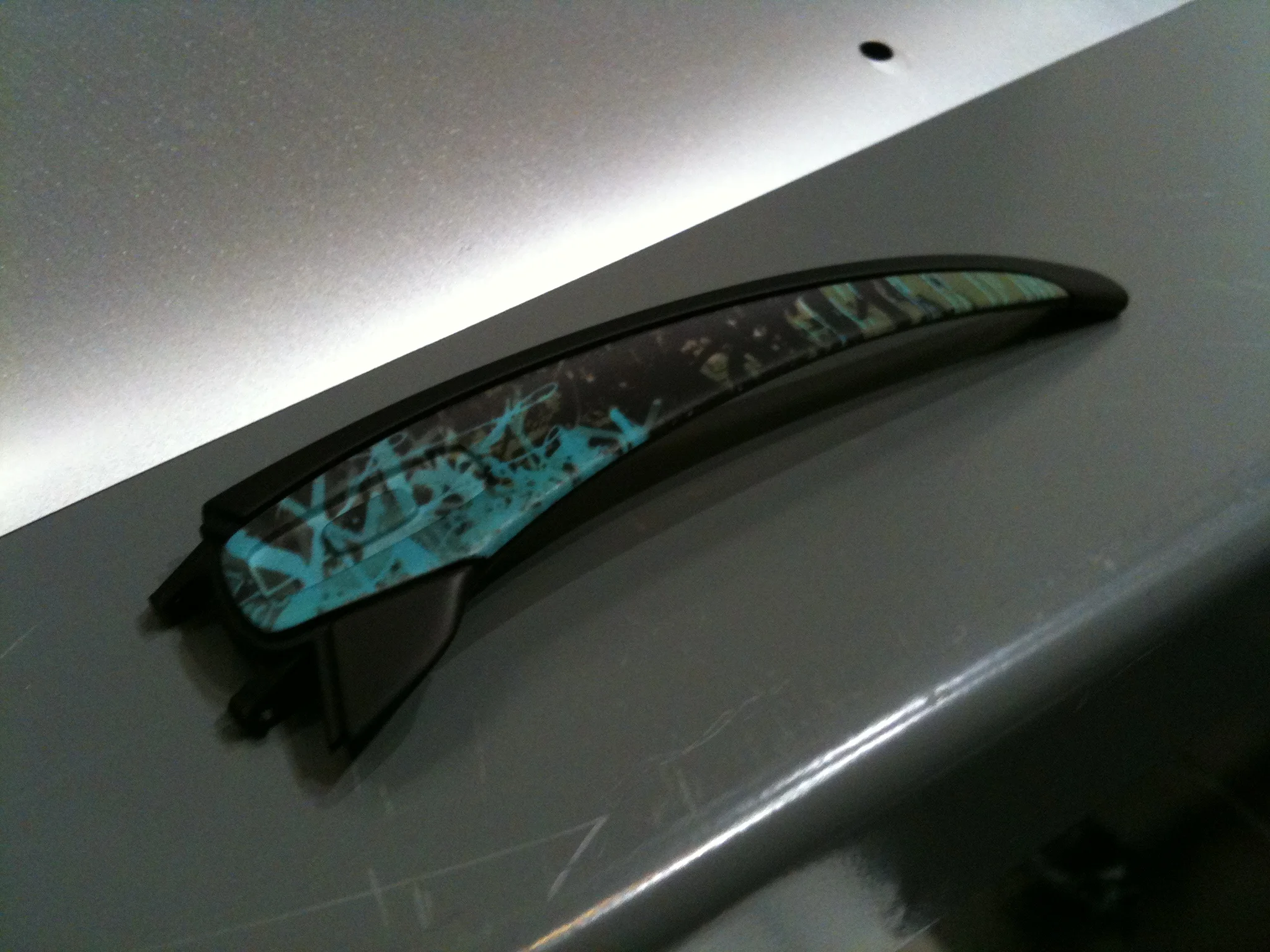
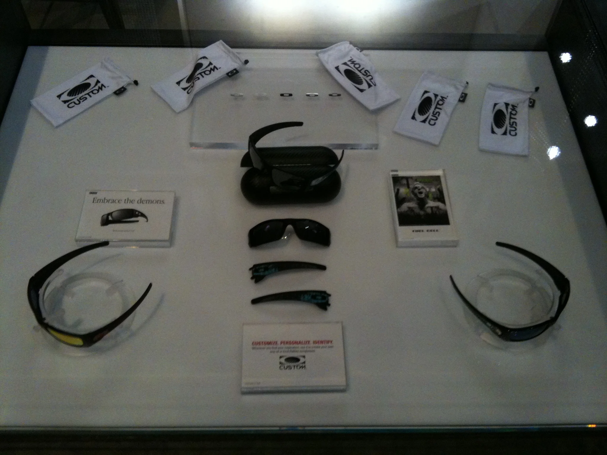
Check out some pics of the dye-sub-print-fusing process now available on the stems of custom Oakley Fuel Cell Sunglasses.
Sorry for the lousy iPhone pics, but the Lobby Store at Oakley Headquarters is now testing (and selling) Custom Fuel Cell Sunglasses with dye sublimation prints on the stems.
You can configure your custom design using a touch screen interface. Currently, there are 4 patterns to choose from and multiple color options, but I’m sure we’ll be adding more in the future.
Once configured, a sheet is printed out with the design which then gets fused onto the stem. It’s a pretty interesting process to see the design being “baked” on in the oven. You can see the sheet adhering more and more as time goes on.
This is what it looks like after it comes out of the oven and the sheet is removed. The last two pics here show the sheet after it’s taken off the rubber stem holder.
Here’s another stem detail before the gunmetal icon is applied, along with some blurry shots of it getting built and on my fat head. The light in our lobby is pretty low so it’s not exactly iPhone camera-friendly.
And finally, here’s a few shots of what the lobby setup looks like:
If you’re in or near Orange County, come on down to 1 Icon in Foothill Ranch if you want to build your own. At present, this is the only location where you can get them done.
Web Creative Team + Munny + Oakley Inspiration = Custom Vinyl Goodness.
These are the results of the Oakley Munny Challenge. A project given to my Web Creative team by my Director of User Experience, Marc Hemeon. He wanted to see how the team would represent “what Oakley means to me.”
View that slideshow in full screen mode for best results.
I won’t get into the details of what each one means, but I will say that my favorite concept of the bunch is the Monster Dog / Monster Pup diorama. If you know anything about Oakley, those are the names of two of our sunglass styles, plus, the art was inspired by some original illustrations previously made for our Legal Enforcement team. Pretty amazing job with Sculpey too. Look at those ears, tail, and Oakley Ellipse!! (not to mention the fire hydrant)
A few other noteworthy items:
- Two of the designs sport removable, custom-made helmets. What am I saying…everything here is custom made.
- Can you spot the one inspired by The Grip?
- Jet-pack-wearing dude has a cigar that actually lights up.
- Crash Test Munny comes with his very own display case.
- Car wax sure gives one of these that extra bit of shine.
- Can you name all of the Oakley products being worn by 80/20?
- Last but not least, I think Steampunk Munny photographed the best so I just had to take a few extra shots of it.
I’m thoroughly impressed with the effort the team put into this. It was all done on their own time. Although this was just project for my Creative team, the rest of my Web team brings just as much passion to their work daily. Follow them on Twitter.


