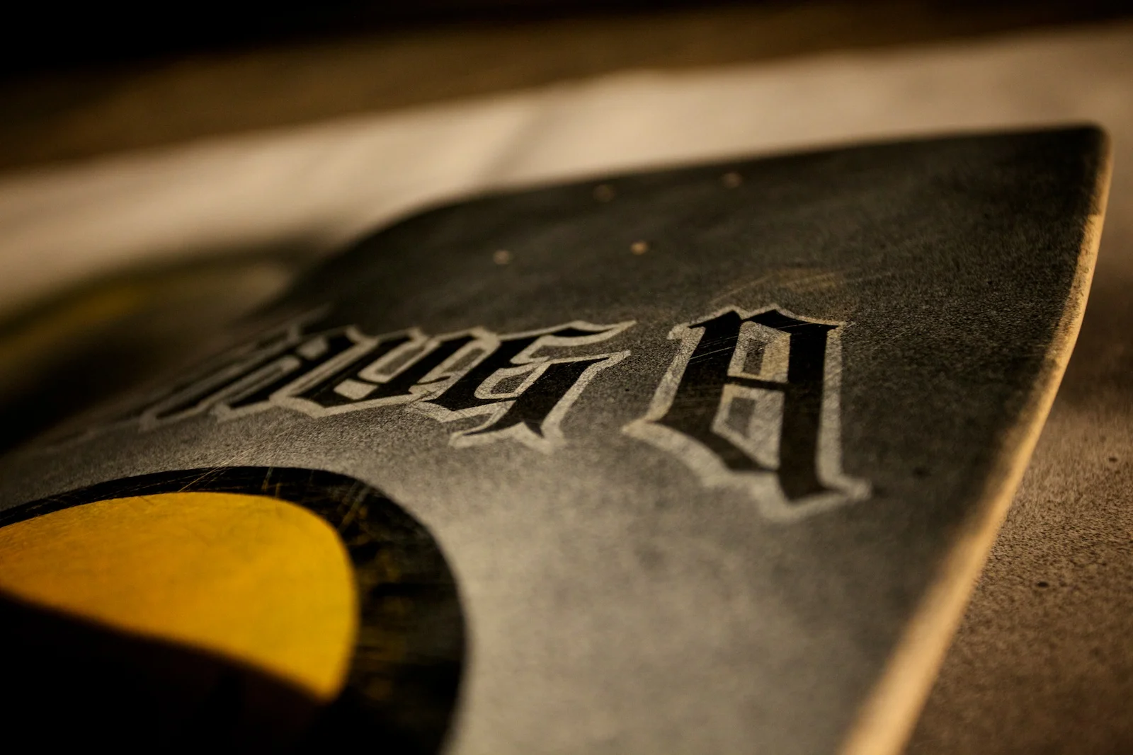
Skate deck progression, part 2.
Step 7: I actually messed up here since I tried a different paint for the yellow skull. I wanted visible thick brush strokes but that didn’t quite work out. I had to clean it off, but there was still some residue left over and I also realized the original circle was placed a little too low. Instead, I masked off a new circle with frisket and spray painted the base. Once that was done, I cut more frisket for the skull detail and first layer of typography.
Step 8: Painted a base layer of chrome for the typography, then sprayed the skull black and added some gradients on the type.
Step 9: Here’s what the deck looked like after removing the frisket at this point. I considered calling this “finished” at this point, but I didn’t like how that original layer of yellow was still visible at the bottom of the skull so I decided to paint a “glow” around the skull to cover it up.
Step 10: Final step was to mask off the skull and type again so I could spray another layer of white for the glow around the skull, then some additional chrome and black for the extra channel around the type.
End Result: I was pretty nervous about that final step since I could have easily messed things up at that point painting more layers that covered up the previous work, but I was relieved it didn’t turn out too bad. Since I used chrome, the visibility of the outer type channel and splatters change depending on how the light hits it. Overall, it was a ton of fun and I’m generally happy with the results.
Return to Part 1


