Step-by-step progression of how I created my “Have A Nice Day” skate deck, part 1.
I hadn’t done an art project in so long that when our Web Creative team suggested we hold a 2-Tone Skate Deck Challenge, I jumped at the opportunity. Had tons of fun doing it, but definitely felt out of practice. Here’s a quick writeup of how I did it.
Step 1: Started with a deck donated by our friends at Arnette. It already had a design on it, so the instructions were to either paint over it, or sand it off to have a clean canvas to start.
Step 2: I was too lazy to sand the board smoothly so I decided to use the original design in the background to some extent for additional textural elements. I scratched up the surface with rough sandpaper to give it that “used” look.
Step 3: Sprayed a little chrome paint in a few key strategic areas to give the base some shine. The pictures don’t really do it justice, but I really liked the way the deck looked at this point. The chrome on black scratched up paint was really cool. I wish more of this look could have been preserved in the end result.
Step 4: Used painters tape to mask off the “rising sun” pattern in the background, then spray-painted a soft black border to draw more attention to the center of the design. In the end, this border kind of disappeared with all the other layers of paint I put on.
Step 5: After spraying the black border, I filled-in the “rising sun” pattern. The design started to look a little too harsh at this point, but I knew I was going to add some additional layers so I didn’t freak out too much.
Step 6: Came back with another layer of spray paint to soften the edges, kick back the background design, and add some texture for modeling. Used both white and chrome in this step for some slight splatter effects.
Posterous seems to be a little buggy when it comes to posts that have lots of different images in different sets, so I broke it up into 2 parts.
Continue on to Part 2
Skate deck progression, part 2.
Step 7: I actually messed up here since I tried a different paint for the yellow skull. I wanted visible thick brush strokes but that didn’t quite work out. I had to clean it off, but there was still some residue left over and I also realized the original circle was placed a little too low. Instead, I masked off a new circle with frisket and spray painted the base. Once that was done, I cut more frisket for the skull detail and first layer of typography.
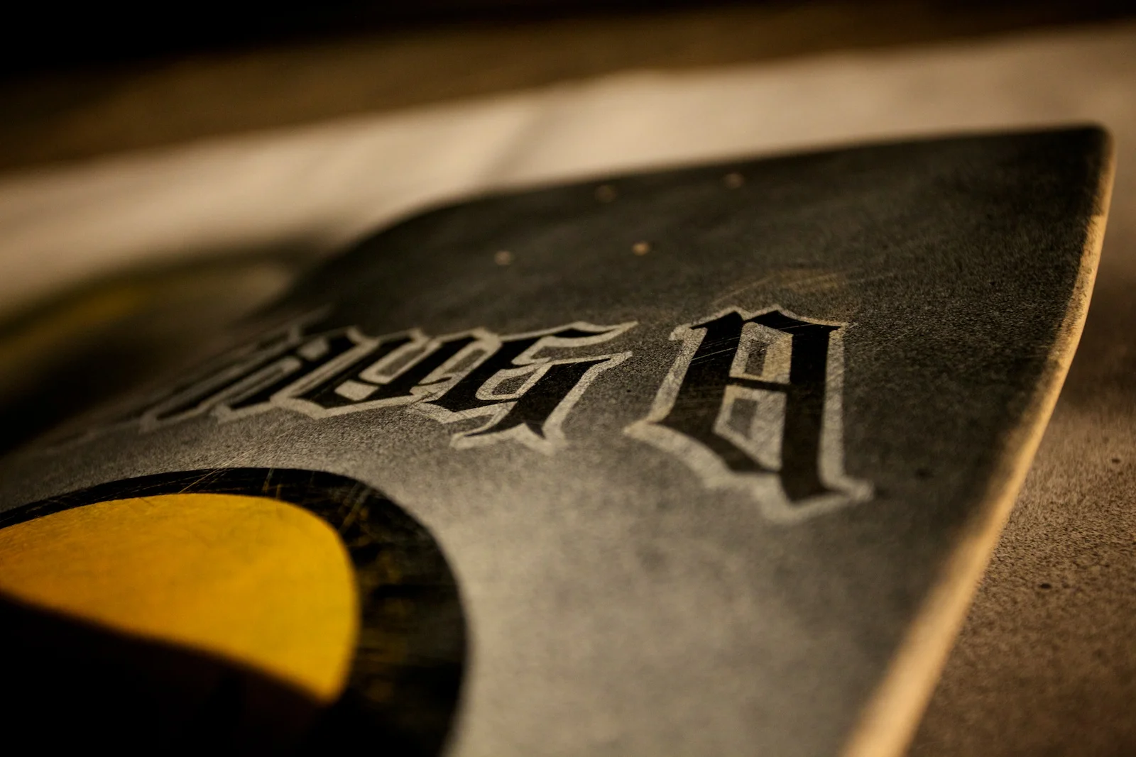
Step 8: Painted a base layer of chrome for the typography, then sprayed the skull black and added some gradients on the type.
Step 9: Here’s what the deck looked like after removing the frisket at this point. I considered calling this “finished” at this point, but I didn’t like how that original layer of yellow was still visible at the bottom of the skull so I decided to paint a “glow” around the skull to cover it up.
Step 10: Final step was to mask off the skull and type again so I could spray another layer of white for the glow around the skull, then some additional chrome and black for the extra channel around the type.
End Result: I was pretty nervous about that final step since I could have easily messed things up at that point painting more layers that covered up the previous work, but I was relieved it didn’t turn out too bad. Since I used chrome, the visibility of the outer type channel and splatters change depending on how the light hits it. Overall, it was a ton of fun and I’m generally happy with the results.
Return to Part 1
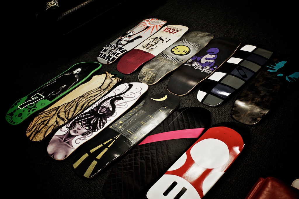
Oakley might be testosterone-filled, but 3 talented gals took 1st, 2nd and 3rd in our Web Team Skate Deck Challenge.
I’m very proud of these three young ladies and thoroughly impressed with the work from them and everyone else on the team on this project. There were a total of just over 200 votes by random Oakley employees who chose to participate. It was a fun project for us to work on. Big thanks to @mizo_kizo for setting it all up.
And the winners are...
1st Place: Lacey Garcia

2nd Place: Tara Larivee

3rd Place: Cassie Fuertez

And here’s a few shots of the other artists, presenting their creations:
BMW 1M in all it’s glory, finally revealed.
Pretty sweet-looking car. While it makes sense, I wasn’t expecting the front bumper to take design cues from the M3. I thought they would do something a little different, but it still looks unique with the air intakes on the sides.
Some stills from the video can be found on BMW Blog.
2-Tone Skate Deck Challenge by Oakley Web Creative team.
Inspired by the recent 2-Tone Dunny Series, our Web Creative team decided to hold a 2-Tone Skate Deck Challenge. Armed with decks donated by our friends at Arnette, each participant was given a PMS color swatch they had to use, in conjunction with any other form of black & white. There were no rules other than you had to stick to your specified color. Theme could be whatever each individual chose. Most chose to use traditional paint, but one was actually sewed (see second-to-last closeup shot above).
We even had an entry from Marco’s boy, Hunter. He got a chance to do one after @sixmode informed us he probably wasn’t going to have time. The boy unintentionally dissed Chris during his presentation and Chris turned beet red. Too bad I didn’t get a shot of that.
First, Second and Third place winners will receive Arnette decks, labeled appropriately, 1st, 2nd, and 3rd, like the one below:
I have some other shots of individuals presenting their work, but will refrain from posting those until all the final voting has been done so the judges don’t get tainted by who did which one.
Here’s a quick snap of some of the crew:
Dreamt that @oakley HQ was @darthvader’s minions’ new home. It was remodeled though so I couldn’t find the web team.
Cue Vader music. It was a weird dream for sure. They had removed the icon from the facade and replaced it with a long floating plank area where storm troopers were conducting some odd experiment with snow and rainbows in large life-sized glass snow globe-like enclosures.
As I walked around looking for my office, I kept running into unfamiliar obstacles. It felt like a Las Vegas hotel since there were dining establishments and rides everywhere. I eventually found some elevators but it took me to the wrong floor. When I turned to get back on the elevator I noticed a square O on one of the floor buttons so I pushed that one. Somehow I ended up stuck on an outside ledge, similar to the huge fan in our lobby (only smaller) and couldn't get back in. I held on for dear life until my brother helped me back in. O_o
Instead of seafood ramen, the boy opted for a whole bowl of baby octopus.
He went for Premium Pork ramen so he didn't get octopus overload.
I am totally the target audience for this BMW iPhone/iPad commercial.
Ever since iPods came out I've been obsessed with integrating them into my car. The people in this commercial are my people.
Gap reverts to old logo. Design world rejoices. Laird+Partners loses credibility.
AdAge reported a couple days ago that the Gap logo was actually for real, and not some stupid PR stunt or elaborate crowdsourcing experiment. Today, they broke the news that Gap will scrap their new logo and return to the old design. I am so glad Gap decided to revert back. It was the only thing they could have done to “fix” the mess that was created by the release of their new logo. They could have very easily dug themselves deeper with any other move.
It’s a good day in the world of design. Well, for everyone except Laird+Partners, the agency who was responsible for that debacle. They should stick to advertising and not try to design logos...or websites for that matter. Here's what it looks like on an iPhone right now:
Way to go guys. Here’s a tip. When building flash-only websites, try to at least make it look like you attempted to view it on a mobile device. Good luck getting out from under this PR mess...
My 2tone Dunny Case arrived on Friday. Bummed I didn’t get the Huck Gee one!
The Huck Gee version is my favorite, but it is only 1/32 so it’s not in every case. That’s a real bummer, but at least I got some of the mystery ones. I also didn’t get the Gary Baseman one, but that's 1/192 so I would been really lucky if I had gotten that.
Here’s what came in the case on my toy site. You can see which ones I got duplicates of.


