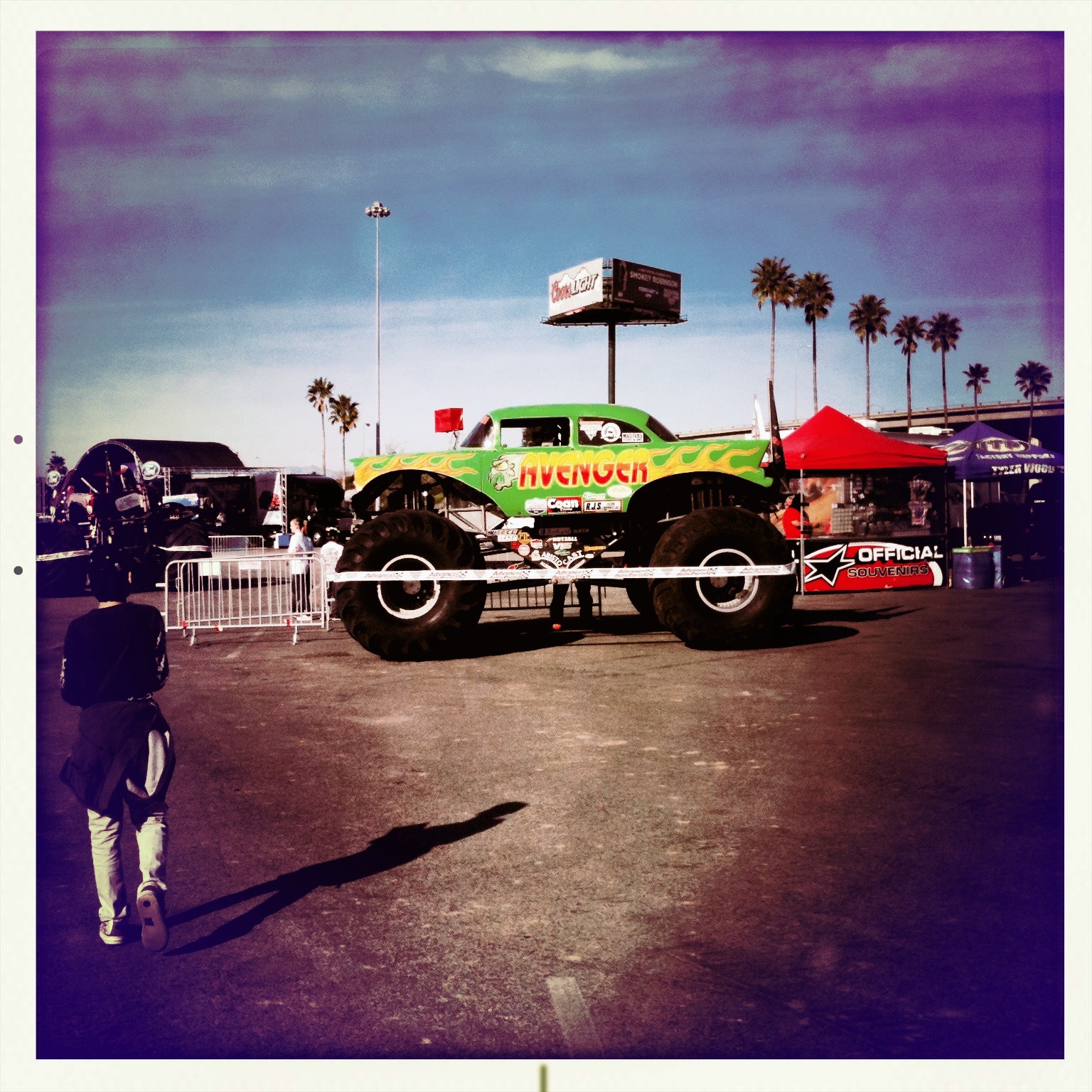
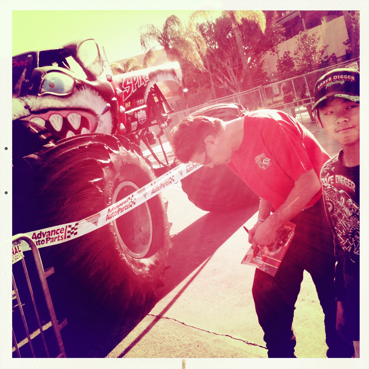
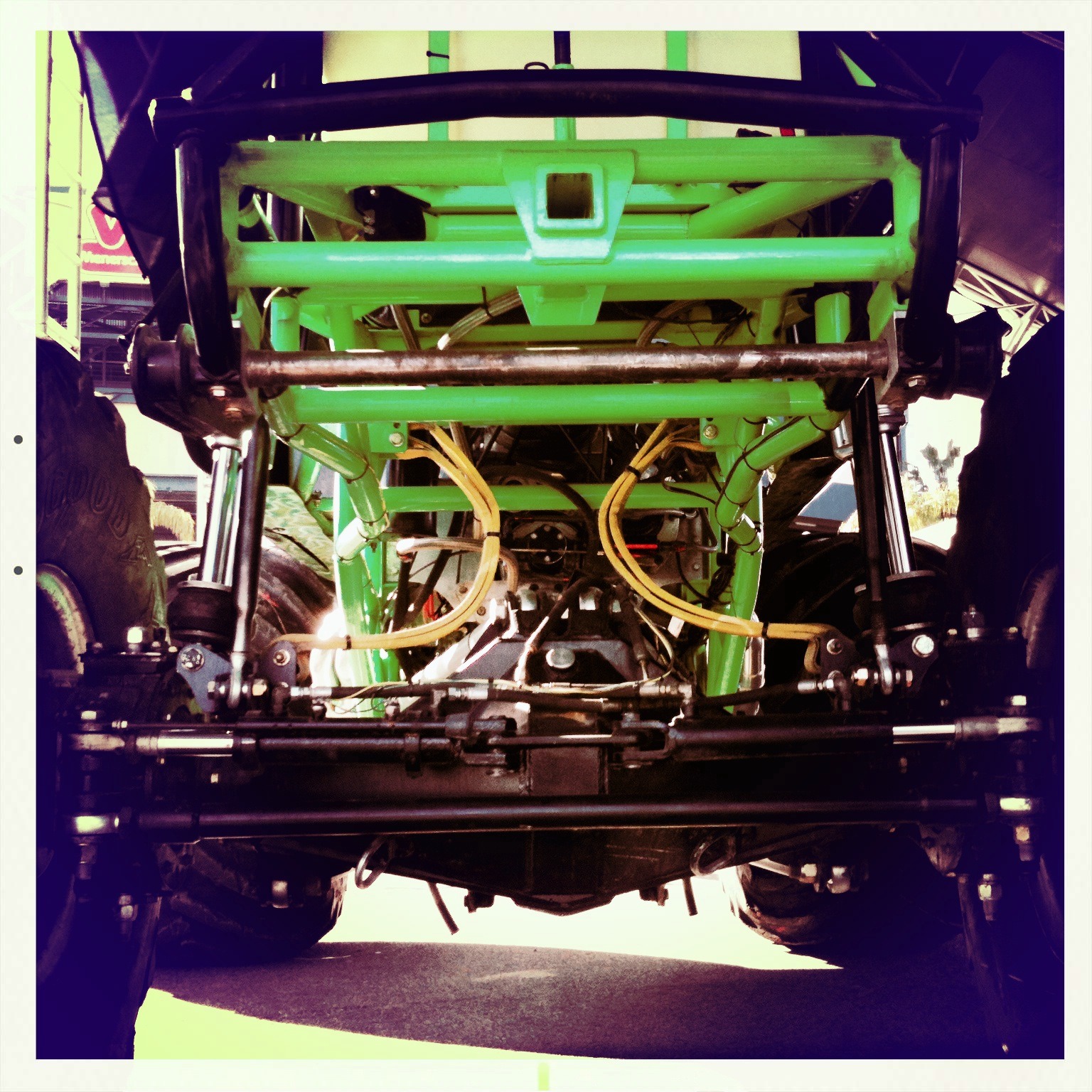
A few random Monster Jam truck shots before the event.


Official Sony Video comparison of GT5 vs real life Nürburgring.
Remember the user-generated video of Nürburgring in real life versus GT5? Here’s the official version from Sony.
The first of 3 Minions my wife is crocheting for my kids.
This one is for the boy. Since my girls like blue and pink, my wife is planning on making two more, one with dark blue and one with pink overalls.
This is how I found the boy playing video games in his room today.
He loves getting all wrapped up in blankets when he sleeps or watches movies, but this was the first time I've seen him doing this while playing video games.
Evolution of Starbucks logo from 1971-2011. I like how clean it looks without the type.

When a company can drop the type and have a mark still have instant brand recognition, it's a good thing. I like how clean it looks.
This Futurity article indicates some of the reasons as being for localization purposes in Asia, which makes a ton of sense, however, if it's a new brand being introduced into the market, I’m not sure not having a name written out somehow is the best idea. The most surprising thing from this article though, is that Starbucks is 40 years old!
First, shotguns in cubes, now sledding by the tank. #HowWeRoll @oakley
Just a few quick videos from our little afternoon break at Oakley. Hot chocolate and cookies were also served. Love my job.
What is this and how the hell did it get stuck inside my rear windshield?
The next obvious question is, how do I get it out? Looks like I'm gonna be removing some car panels this weekend >_<
Slower than a sleigh, but the elves seem to enjoy it. My video interpretation of the @oakley holiday card.
The Oakley Tank got decorated for Christmas and a holiday card was made out of it. Last week an old-style loudspeaker was installed (like in M.A.S.H.) that blares out various holiday songs intermixed with with radio-station-changing static all day long. I cracked up when I heard the carols in Spanish so I just had to make a video.
Here’s the official version:


