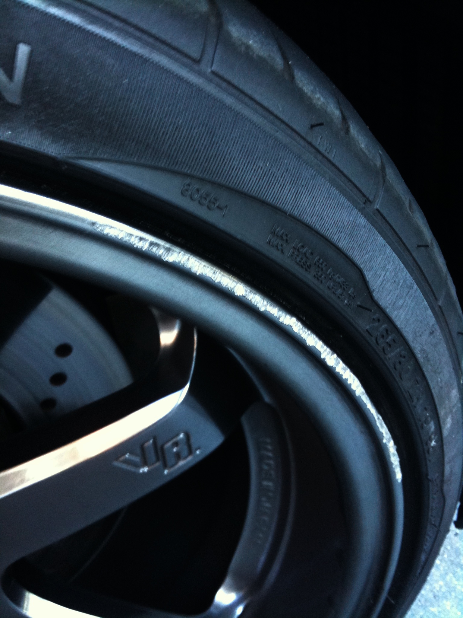
Nooooo! Anyone know a good wheel repair guy?
Stupid tight parking spots next to curbs with little room to turn! I'm usually really careful (for this exact reason) but this one got me during a lapse in attention. Grrrrrr…just in time for the next MFest gathering this Saturday too :(
The boy's hair has turned naturally curly. My brother calls it “anime hair” for good reason. Compare for yourself.
His hair used to be super straight, but somehow it's gotten really wavy/curly in adolescence. I'm sure his refusal to comb has something to do with it…but still, it’s getting pretty wild. Looks like it’s part Spike Spiegel (Cowboy Bebop), part Mugen (Samurai Champloo) but with a little more wave to it.
Might turn into Afro Samurai if he keeps letting it go.
GoPro + Waterproof Housing + Family in pool = My First 60fps Final Cut Pro X test edit.
This was “mess with stuff I’ve had but haven’t had a chance to mess with yet” weekend. I’ve been waiting to try out Final Cut Pro X but didn’t have any footage to experiment with. Then I remembered that I also hadn’t tried the waterproof housing on the GoPro I got last Christmas yet either, so it was time to jump in the pool. I was looking forward to getting some slow-mo cannonballs with the boy to test out 60fps, but surprisingly he didn’t want to go swimming. Fortunately, it was very hot so the rest of the family was more than willing.
This is the result, a lot of camera grabbing and splashing later. There was a short segment where I floated the camera on some flip flops and let it just glide along the water. That was kind of fun, but my ghetto rig wasn’t very stealth when I first started as you can see in some clips above, LOL. I’m not too thrilled with the clarity of the GoPro HD and the audio quality blows big time. I wish there were some good FCPX tutorials out there since I didn’t really know what I was doing either. Not really happy with the limited color grading capabilities, although I may just be doing it wrong. Might want to come back to this piece later after I get a chance to learn how to do it better.
Overall, the basic learning curve on FCPX is fairly easy. But as you can see, the edit is pretty basic as well. I didn’t bother trying to figure out any of the more complex features. I love how simple it is to slow down / speed up the clips by dragging, but I definitely need to learn how to do more precise timing editing. I like to cut to music, and not necessarily in a linear manner, so not knowing the tools kind of jacked me up a little.
One of the biggest “pros” I think is the ability for FCPX to render things in the background while still allowing you to preview the edits, mostly real time. There was some jumpiness, but for the most part I was able to keep going without waiting for renders to take place. I used a dual core iMac…hardly a video processing powerhouse, and the speed was decent. I was also working off a Drobo, so not even direct on the internal hard drive.
Another big “pro” for me is the ability to use native H.264 files without needing to convert them to AIC or some other format. Plus, you can set FCPX to reference the files wherever they are stored versus making duplicate copies in the project folder. I hate having multiple files taking up unnecessary storage space.
All-in-all, I’m fairly happy with FCPX. It does feel like iMovie on steroids, which is both good and bad. But I am a bit disappointed in the lack of some more pro features. However, that comes with 3 big caveats:
- I’m a total amateur.
- I probably just don’t know how to do certain things yet.
- If Apple history is any indication, more features are just around the corner.
I definitely like this better than Final Cut Express. Time to retire that app, but it’s a bummer FCPX won’t convert FCE files. I sure hope we don’t start seeing a bunch of people using the canned themes though. Most of those are horrible and need to stay in iMovie.
Music by Smash Mouth.
Limited Edition Oakley Transformers 3D Gascan in hand. Looking forward to seeing the movie soon!
Autobots Side:
Decepticons Side:
It's hard to tell from these photos, but the icons on each side have Autobot and Decepticon logos screened on them. Get yours on Oakley.com while you can. Supplies are limited.
Before & After comparisons using the Ansel Adams filter in Camera+ for the first time.
Who would have thought a 3Gs iPhone could take pics like this? I certainly didn’t. For comparison, check out the originals. 3 basic filters on Camera+ did the trick on these black and whites:
- Clarity
- Ansel Adams
- Rounded White Border
- (plus crop and rotate for the square shots)
The Exhaust shot below is cool, but you can see how the filters went too far on the other two shots with the BMW Roundels. I thought the steering wheel was going to turn out better since it's a halfway decent original.
For this color shot, I used:
- Clarity
- Magic Hour
- Rounded White Border
I had been using Camera+ and their Clarity filter with mixed results for a while, but I’m pretty happy with how these turned out. My one complaint is they should provide a “strength” slider for Clarity, just like they do with some of their other effects so you can control how far it goes.
I blame @shanemielke for making me want to shoot a bunch of things I saw today.
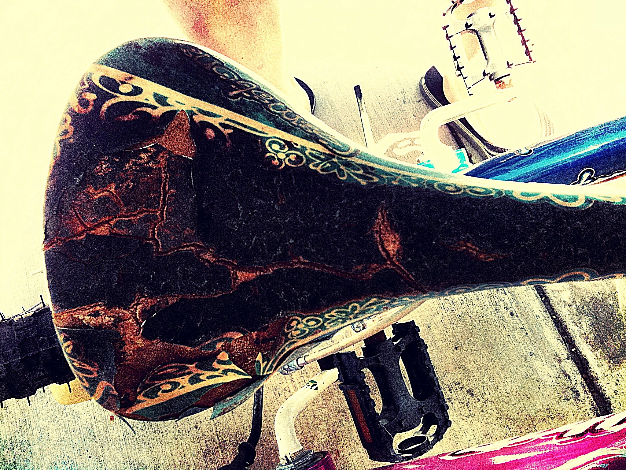
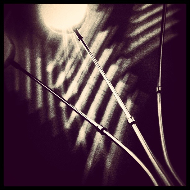
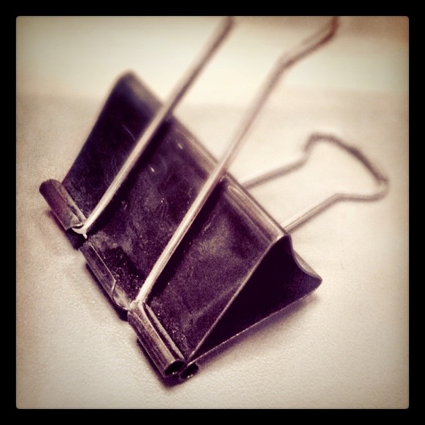
One look at his Instagram stream and you’ll know why. I just had to take a few random photos of things around the house today.
I ended up having to charge up the iPhone frequently since it kept running low on batteries.
Some examples of why I like, but also have issues with Instagram.
I’ve said it before and I’ll say it again, “I’m not a big fan of Instagram.” Now, lately I’ve been using it a lot more since I’ve been able to discover some pretty great shots by some very talented photographers, but at the end of the day, I’m still disappointed with the fact that it does not save in full resolution.
Have a look at the shots below, and flip to their full resolution counterparts. All of these images were taken with an iPhone 3Gs, processed initially with the Camera+ app (mostly the clarity filter, but in some cases I also added some additional effects), then cropped and re-processed in Instagram. I like to use the tilt-shift effect, so it’s not the focus that I’m complaining about. Just the fact that detail is lost when the image gets down-sized.
It’s a bit hard to tell the difference unless you look at the enlarged views though
The loss of detail is most apparent in the following shots:
On this Spawn shot, I also used Pic Grunger to add some additional texture, then Photoshop Express to sharpen it up a bit. But after going through Instagram, while I like the overall color treatment better, the image has lost resolution and detail.
In all fairness, here’s one that really didn’t make much difference, but I think was improved by the new crop and tilt-shift effect (although the dropoff is a bit too abrupt).
I’m also annoyed with the fact that you can’t really view the photos you “liked” in any easy way (at least not that I’ve been able to find). What’s the point of “liking” if you can’t go back and view them again. I’ve come across a lot of really great images that I’d love to see again, but once enough days pass, they’ve pretty much gone into oblivion.
IMHO, Flickr does the best job of displaying your liked (or in their case, “favorited”) photos.
In the end, I like some of the processing effects and I’m finding that I’m enjoying Instagram more now that I’m beginning to explore other photographers streams so I’m likely going to keep using it. I just wish they would keep the photo’s native resolution and actually make a good web interface. Extragr.am doesn’t count. It’s a neat idea and pretty well-designed, but performance stinks. Somewhow, I’m not surprised that it’s a Rails app. The wait time makes it unusable and the error pages I frequently get are all too familiar.
KR19 Riot Police, ready for action...and fresh-baked goodness?
I got a nice chuckle when I opened this and discovered the donut. Didn't know it came with that, LOL.
Oakley Design Team 2’s Amphibious Cyborg Tank FTW!
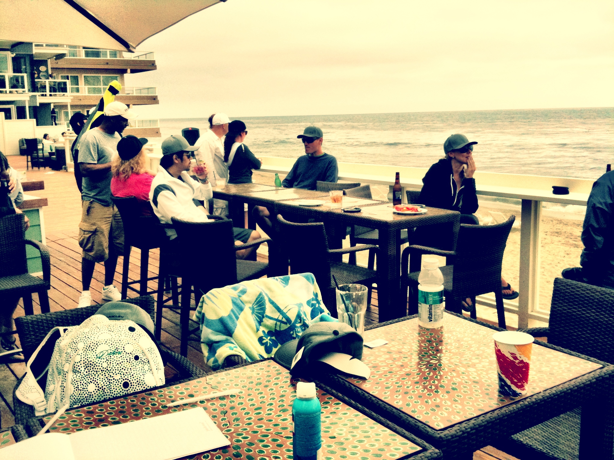
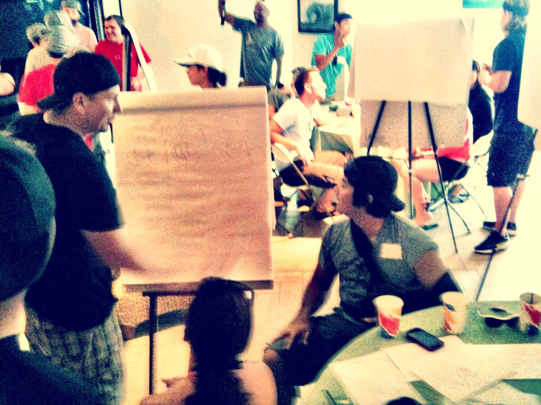
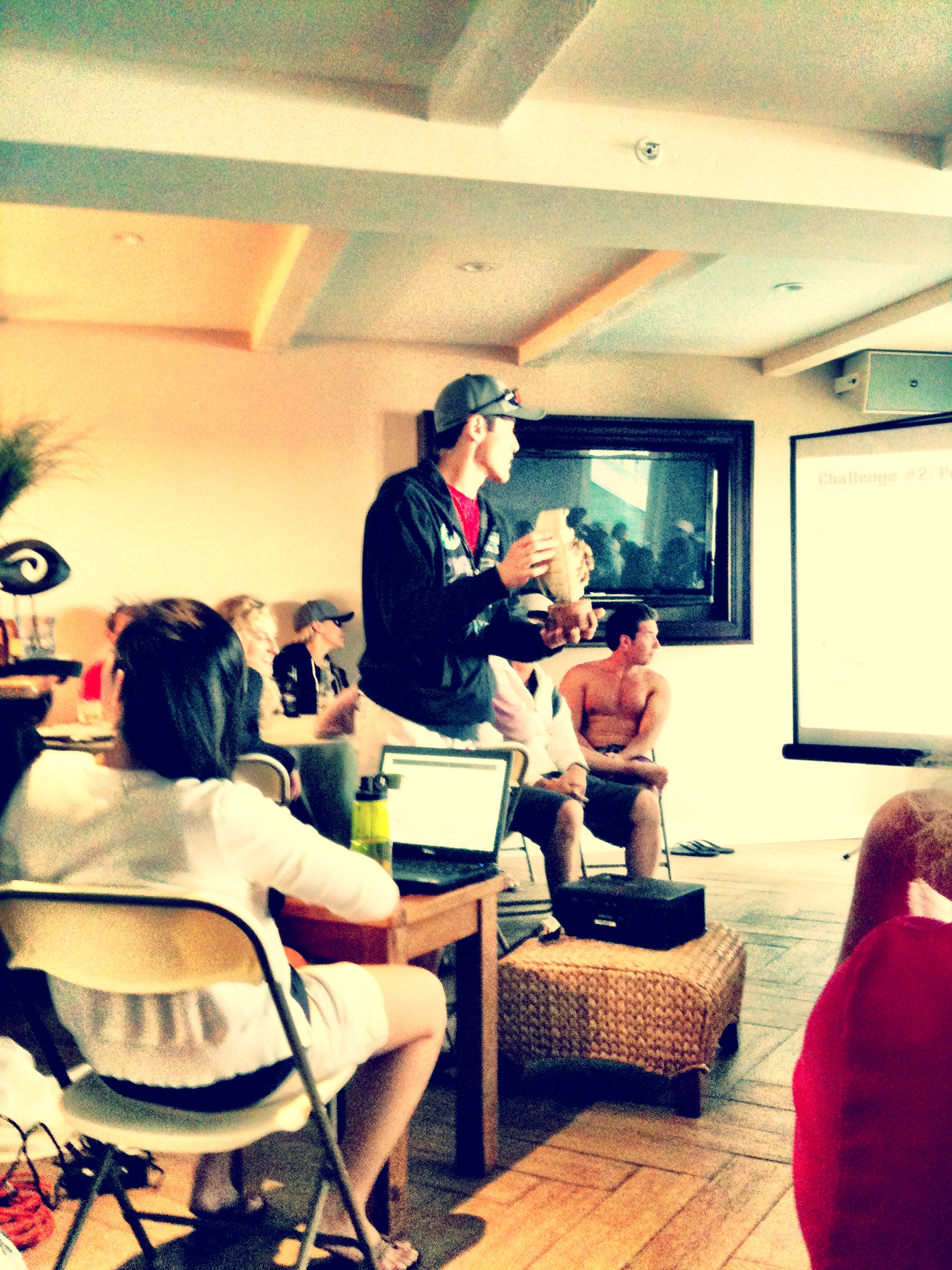
We had a Design Team Building Event today at Laguna Beach, where VP of Design, Peter Yee gathered troops from the Product, Graphics, and Web Creative teams together to challenge our thinking and pit brains, brawn and creativity against each other.
Along with the group discussion, we were split up into 4 teams (mixed departments) and given 3 challenges:
- Sand Castles
- Beach Activities (Tug-o-war and other water + sand related things)
- Pictionary Death Match
I was a member of Team 2. Unfortunately, due to some previously scheduled meetings, I had to run back to the office and missed the Beach Activities Challenge. Probably a good thing though, since my back was completely worn out shoveling sand. Fortunately, I was able to participate in the other two.
We conceived of the following idea for our Sand Castle: A Mechanical Frog Tank. Of course, some Jupiter heritage merged with some Oakley military design. A great group effort here. A quick round of brainstorming and sketches, then we were off to dig, pack and sculpt. Didn’t take me long to realize this 41-year-old body couldn’t dig and drag big buckets of water very long. This is going to be a pain-filled weekend. I unfortunately didn’t get any pics of the final completed sculpture though since I had to split about 20 minutes before it was done.
Here’s our winning sand castle, in various stages of completion:


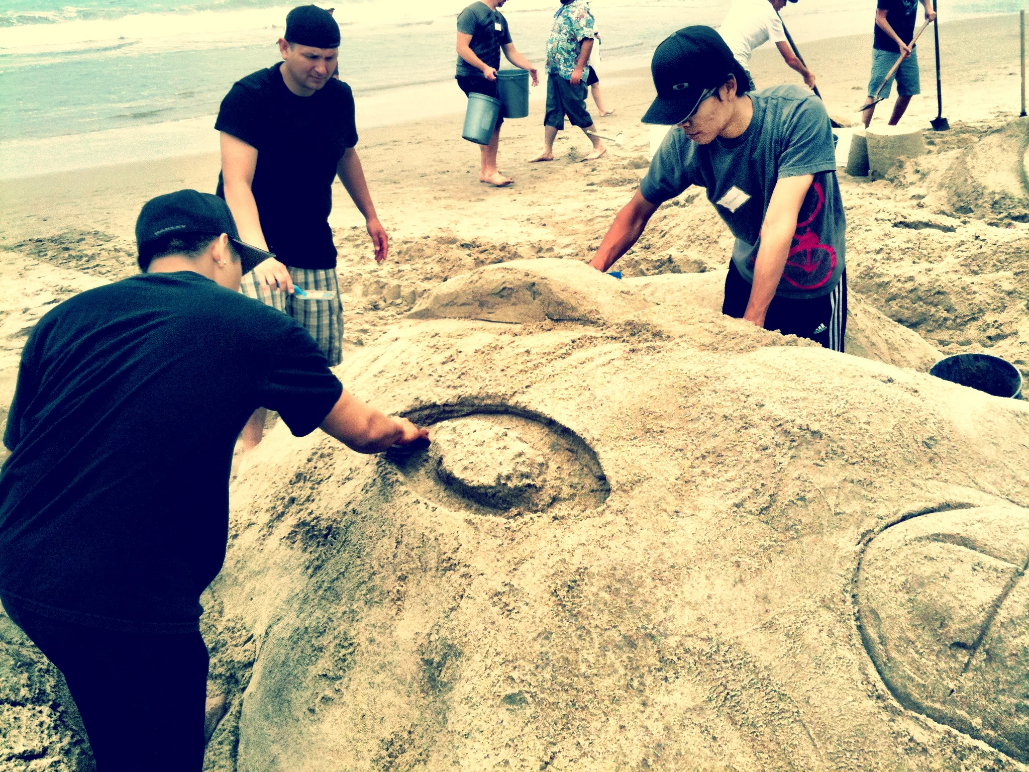

Some details worth noting: Gear on back. Cigar. Tracks leading out of the water. We also had some seaweed that was going to be used for “skin” and camouflage. Since I left early I’m not sure if that ever got done. Will just have to wait to see the final photos.
Team 2 also won Pictionary Death Match by a narrow margin of 8 to 7 over Team 3. By winning 2 out of 3 events, each member of Team 2 earned a paid half day off. I’m sure I won’t be taking advantage of that, but at least @DicksonFong will be able to. He was the only other Web team member on my team.
We don't do “regular” trophies at Oakley, so here’s some photos of the hand-sculpted ones made by non other than Oakley designers.


The Frog was awarded for the best Sand Castle, Pineapple Grenade for Beach Activities, and Winged Skull Torpedo for Pictionary Death Match. Team 2 will be sharing the Trophies, rotating them throughout everyone’s desks. Might be hard to secure time with them though…not sure anyone is gonna want to give them up ;)
Shrink-wrap FAIL. My May issue of BMWCCA Roundel came with a "few" extras.
- 3 copies of People Style Watch
- 3 copies of This Old House
- 1 copy of MSDN Magazine
The Microsoft magazine was the dead giveaway it wasn't supposed to cone to me ;)
All of the magazines are addressed to other people who live in my city.
